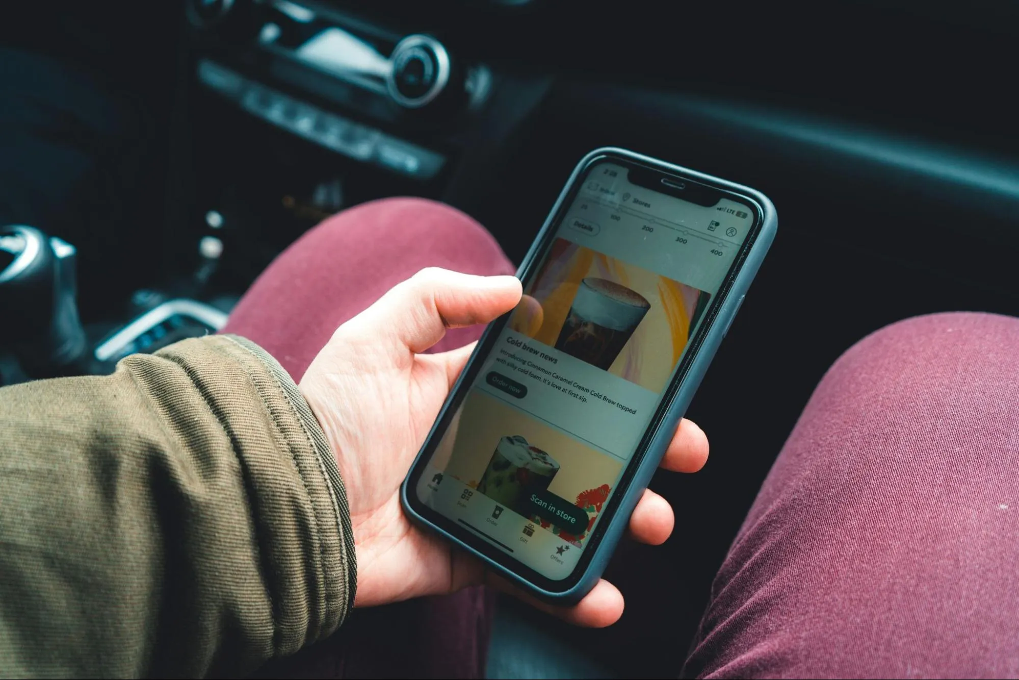
How to Balance Content Length and Mobile Usability in Email Marketing
Crafting the perfect email for mobile readers requires more than great content – it demands a careful balance between length and usability. To help you capture attention and maintain engagement, we’ve gathered insights from content marketers and industry leaders. These experts share 11 actionable tips, from making every word count to optimizing calls to action, ensuring your emails are both impactful and mobile-friendly. Dive in to discover strategies that keep your audience scrolling – and clicking.
- Make Every Word Count
- Keep Emails Concise and Scannable
- Use the 1-2-3 Rule
- Use Layered Content Approach
- Preview and Expand Content
- Prioritize Above the Fold Content
- Balance Information Without Overwhelming
- Use Images Strategically
- Grab Attention Quickly
- Balance Emotional and Informational Flow
- Optimize the Call to Action
Make Every Word Count
I’ve discovered that the secret to balancing content length in mobile emails isn’t about making them shorter—it’s about making every word pull its weight. The truth is that mobile users don’t mind longer content as long as it’s engaging and easy to scan.
One strategy I’ve honed involves structuring emails like a visual hierarchy. Instead of cutting content to the bone, I use bold headlines, short paragraphs, and clear calls-to-action (CTAs) to guide the reader’s eye naturally. For instance, while working with a subscription-based app, we designed mobile email campaigns where the first line acted as a hook, followed by bite-sized sections that delivered value fast. We complemented this with bold CTA buttons strategically placed after each major point.
Many of my clients were surprised to learn how we incorporated longer content for storytelling—like user success stories—while maintaining engagement. By breaking the story into “snackable” segments, each framed with a compelling visual or subheading, we saw open rates increase by 25% and conversions by 15%.
The key isn’t to shrink the content but to design it for how people read on mobile: skimming first, diving deeper if intrigued. It’s about making longer content feel lighter. That’s how you turn a scroll into a win.
 Nicholas Robb
Design Agency for Startups, Design Hero
Keep Emails Concise and Scannable
When creating mobile-friendly emails, I focus on keeping things concise and scannable. Mobile users skim, so I stick to short paragraphs, clear subheadings, and plenty of white space. For example, I keep subject lines under 35 characters and email copy between 50-125 words so the key message lands quickly. I also prioritize the most important information “above the fold”—placing the CTA near the top ensures users see it without scrolling.
Another go-to strategy is using an F-pattern layout, which matches how people naturally scan on mobile. Fonts are always at least 14pt for body text and 22pt for headlines to ensure readability, and I keep the design simple—clean colors, one-column layouts, and limited fluff. This way, the email looks polished and is easy to engage with, even on a small screen.
 Katarina Mirković Arsić
Content Marketing Manager, Recharge Health
Use the 1-2-3 Rule
When crafting mobile emails, the key is finding the balance between keeping things concise and delivering value. I aim for short, punchy subject lines and snappy paragraphs, ensuring that the core message is front and center. Mobile users tend to skim, so you need to grab their attention quickly.
One strategy I’ve used successfully is the “1-2-3 Rule”: one clear headline, two key points, and three sentences max for the body. Adding a bold call-to-action button ensures usability—it’s easy to click, even on smaller screens.
To optimize further, I always preview emails on different devices to ensure the layout works across screens. This approach has consistently improved engagement rates while keeping our emails user-friendly and actionable.
 Tom Jauncey
Head Nerd, Nautilus Marketing
Use Layered Content Approach
I use a “layered content approach”: structuring emails to prioritize scannability without sacrificing depth for users who want more. I break content into micro-blocks—bite-sized chunks of information with expandable elements like “read more” links or collapsible sections.
In a mobile email promoting a webinar, I included:
- A short, bold headline summarizing the key benefit.
- A single compelling sentence as a teaser.
- A clickable CTA leading to a landing page with full details.
- Optional in-email links to FAQs for users wanting more context without overwhelming the primary message.
This makes sure that the essential information is front and center while giving readers the option to dive deeper if they choose. It works because it respects mobile users’ limited attention spans and keeps the design clean while still offering value to those who want additional context. The result? Higher click-through rates and reduced content fatigue.
 Inge Von Aulock
Founder & COO, Penfriend
Preview and Expand Content
We’ve found that using a “preview and expand” approach works well for mobile email content. Instead of cramming full articles into emails, we provide concise previews with clear calls-to-action for readers who want more detail.
When redesigning our client newsletter for mobile, we broke down long marketing updates into scannable sections with expandable details. The main message appears in the first two scrolls, with bullet points highlighting key information. We keep paragraphs to three lines or less and use plenty of white space to make scanning easier. For example, our monthly marketing tips now start with a clear headline and one-sentence summary, letting readers tap to see the full explanation if interested.
Mobile email content works best when you respect the reader’s time and screen size. Focus on delivering value quickly while making it easy for interested readers to dive deeper when they choose to.
 Aaron Whittaker
VP of Demand Generation & Marketing, Thrive Digital Marketing Agency
Prioritize Above the Fold Content
Mobile users tend to skim emails quickly, so delivering concise, impactful messaging that aligns with their needs without overwhelming them is essential.
One effective strategy I’ve used to optimize mobile user content is prioritizing the “above the fold” content. This means focusing on the first 3-4 lines of text, which appear without scrolling. These lines should include a compelling subject, a clear value proposition, and a call to action (CTA) that immediately grabs attention. I also ensure the email copy is broken into digestible sections with short paragraphs and plenty of white space. This increases readability and prevents the user from feeling overwhelmed.
I also ensure links and CTAs are large enough to be easily tapped on smaller screens. Using buttons rather than text links ensures the user can interact with the content easily.
Lastly, A/B testing is essential. We test different lengths, CTA placements, and designs to determine what works best for our audience. This data-driven approach allows us to continuously refine and improve engagement rates while keeping the content user-friendly for mobile users.
 James Parsons
CEO, Content Powered
Balance Information Without Overwhelming
Mobile emails must strike a balance between providing enough information to be valuable without overwhelming the reader. I often focus on concise, scannable content with clear, attention-grabbing subject lines and a strong call to action. Short paragraphs, bullet points, and subheadings make it easy for mobile users to skim the email and find the key information they need quickly.
I also prioritize using visual hierarchy to guide the reader’s eye, ensuring that the most important messages stand out. This involves placing critical content at the top, using bold text or larger fonts for key points, and breaking up the email with images or graphics that complement the text.
Another key aspect is ensuring the email design is mobile-responsive. I make sure that fonts are legible on small screens, buttons are large enough to tap easily, and the overall layout adapts smoothly to various screen sizes. By testing emails on multiple devices before sending, I ensure the content is both visually appealing and easy to navigate.
In short, keeping it short, scannable, and visually clear is key to optimizing mobile email content for maximum engagement.
 Josh Bluman
Co-Founder, Hoppy Copy
Use Images Strategically
To balance the length of content in mobile emails, I use images strategically. I start with one key image that reinforces the main purpose of the email. If, for example, the email is about a service update, I include a simple, visually appealing header image that is consistent with the message. This grabs attention without taking up too much space or distracting from the content.
I always ensure that images are optimized for mobile screens. This means resizing them to a width of around 600 pixels and compressing the file size to under 100 KB using tools like TinyPNG or Squoosh. These steps help the email load quickly, even on slower connections, and ensure that the image looks sharp on all devices without overwhelming the recipient.
The body of the email is then focused on clear, concise text. The image acts as a visual hook, but the message itself is designed to be skimmable, with short paragraphs and bolded key points. This balance ensures that the email grabs attention, delivers the necessary information, and maintains usability on mobile devices.
 Tracie Crites
Chief Marketing Officer, HEAVY Equipment Appraisal
Grab Attention Quickly
With an average email reading time of just 5-10 seconds compared to website engagement (1-3 minutes), you need to make every second count. Keep your emails short, sharp, and personalized to grab attention fast.
Start with a subject line and preheader that are clear, intriguing, and impossible to ignore. The vast majority of users won’t download the images in your email, so assume users won’t see the images, does your email still make sense?
Write in plain English so your message is easy for everyone to understand, using tools like Hemingway to refine your content. If there’s too much to say, don’t cram it all into one email-design a customer journey across your channels to deliver the message in stages.
Think about what the needs and interests of users on your list. Segment your audience and tailor your emails for each group to make your content feel relevant and personal. This approach ensures you engage readers quickly while driving them to take the right action for them.
 Adam Boucher
Director, Turtle Strength
Balance Emotional and Informational Flow
Achieving a balance between emotional flow and informational flow in mobile emails is one of the most effective ways to maintain reader engagement. I think it works best when you alternate between creating an emotional connection and delivering valuable details.
For example, starting with a relatable question like, “Does the air in your home feel as fresh as it should?” immediately engages the reader on a personal level. Following that with a short, informative statement such as, “Upgrading your HVAC filter can improve air quality and reduce allergens by over 90%,” adds credibility and value. This back-and-forth keeps the reader invested without overwhelming them with too much data or too little substance.
 Jason Stelle
Digital Marketer, Filterbuy
Optimize the Call to Action
Optimizing the call to action (CTA) is imperative. It should be prominent, clickable with a thumb, and lead to a seamless experience once clicked—like a mobile-friendly landing page. Additionally, we test different image-to-text ratios to ensure that the visuals enhance, rather than distract from, the message. The content should be scannable, without heavy images or long copy that might overwhelm the user.
 Roman Hipp
Co-Founder, BetterContact
Submit Your Answer
Would you like to submit an alternate answer to the question, “How do you balance the length of content in mobile emails to maintain engagement while ensuring readability and usability? Can you describe a strategy you’ve used to optimize content for mobile users?”


